Role
Freelance Senior Graphic Designer
Category
Social Media Advertising, Static Ad
Industry
Beauty & Skincare
Overview
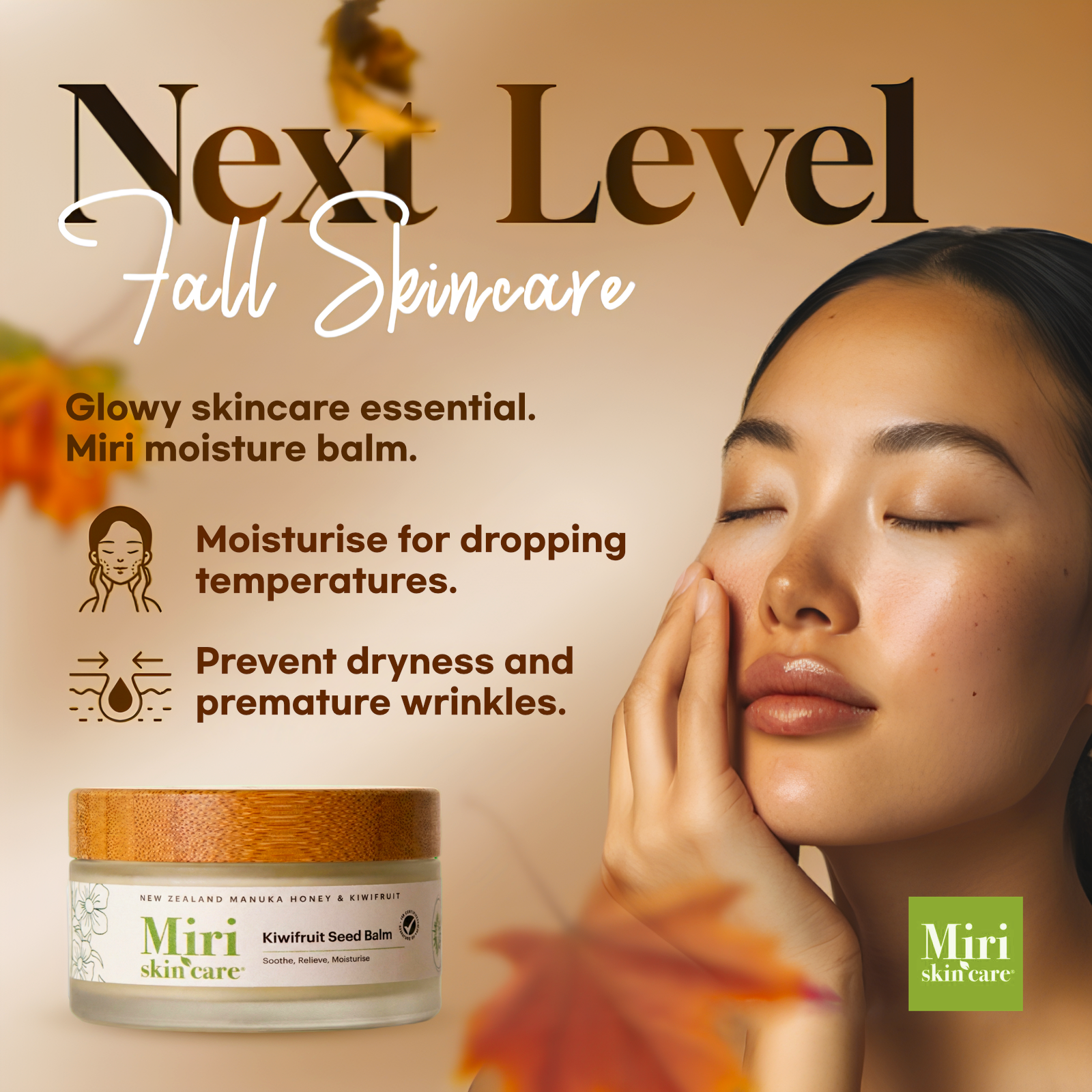
Miri Skin Care commissioned me to create the key visual for their “Fall Essentials” campaign, promoting the Kiwifruit Seed Balm. The goal was to position the product as a seasonal must-have by balancing natural ingredients with clinical effectiveness, targeting concerns such as dryness and dehydration during colder months.
Challenge
The skincare market is highly saturated, especially within hydration-focused messaging. The challenge was to communicate rich moisture benefits without making the balm feel heavy or greasy, while also signaling the autumn season clearly and maintaining Miri’s clean, minimalist brand identity.
Solution
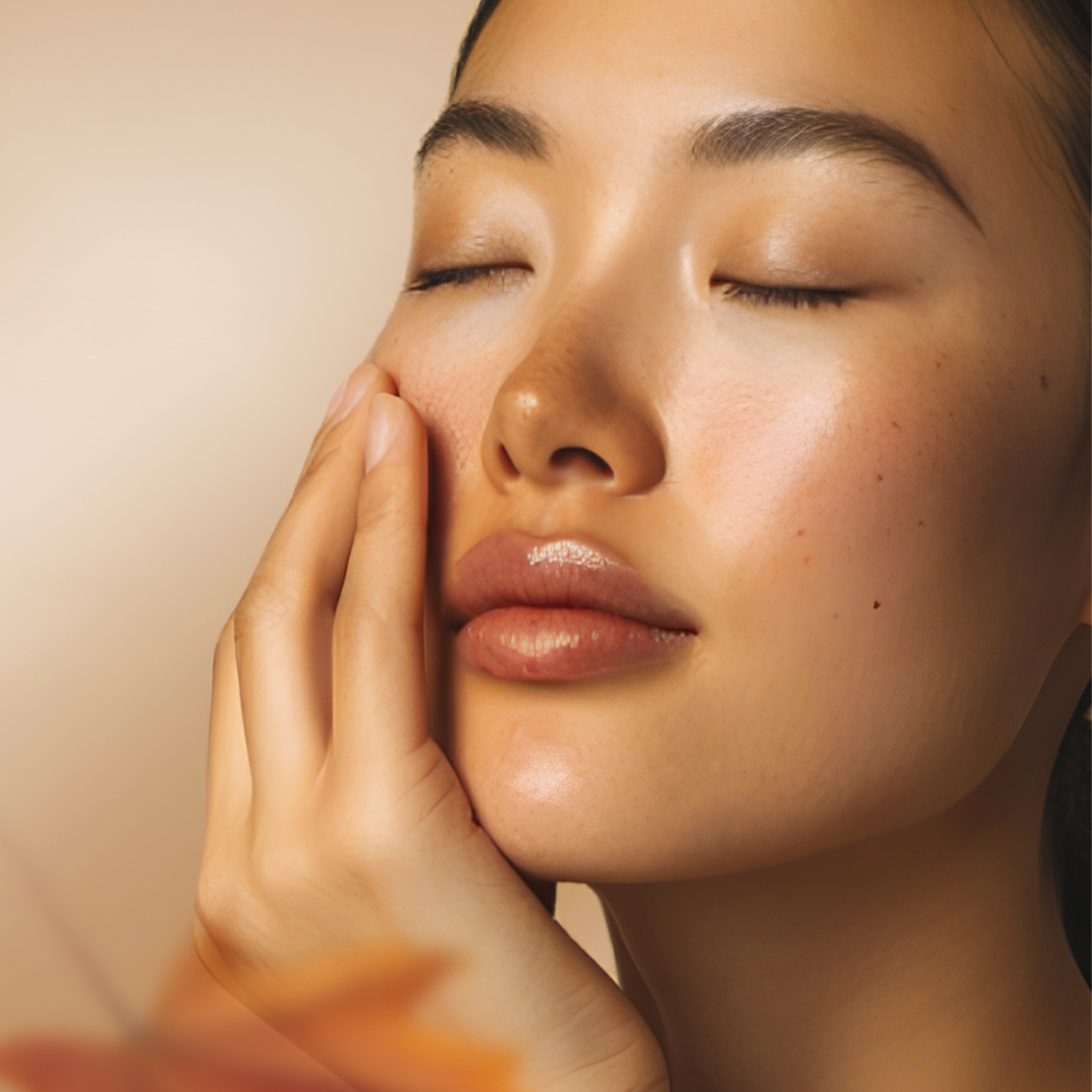
I developed a “Soft Autumn” concept that emphasizes warmth and glow rather than dark, moody fall visuals. A warm beige gradient and subtle falling maple leaves establish seasonal context without visual clutter. Typography pairs a bold serif headline to convey authority with a handwritten script to add softness and approachability. The layout is structured around a clear hierarchy: a dewy model portrait as the aspirational focus, concise benefit icons for fast comprehension, and a prominently placed product jar to anchor the composition.
Results
The final design positions the balm as a seasonal essential rather than a generic moisturizer. Clear iconography reduces cognitive load and communicates benefits almost instantly, while the open, airy layout preserves Miri’s natural-luxury image. The warm color palette also helps the campaign stand out against the cooler-toned hydration ads commonly used by competitors.
Freelance Senior Graphic Designer
Category
Social Media Advertising, Static Ad
Industry
Beauty & Skincare
Overview
Miri Skin Care commissioned me to create the key visual for their “Fall Essentials” campaign, promoting the Kiwifruit Seed Balm. The goal was to position the product as a seasonal must-have by balancing natural ingredients with clinical effectiveness, targeting concerns such as dryness and dehydration during colder months.
Challenge
The skincare market is highly saturated, especially within hydration-focused messaging. The challenge was to communicate rich moisture benefits without making the balm feel heavy or greasy, while also signaling the autumn season clearly and maintaining Miri’s clean, minimalist brand identity.
Solution
I developed a “Soft Autumn” concept that emphasizes warmth and glow rather than dark, moody fall visuals. A warm beige gradient and subtle falling maple leaves establish seasonal context without visual clutter. Typography pairs a bold serif headline to convey authority with a handwritten script to add softness and approachability. The layout is structured around a clear hierarchy: a dewy model portrait as the aspirational focus, concise benefit icons for fast comprehension, and a prominently placed product jar to anchor the composition.
Results
The final design positions the balm as a seasonal essential rather than a generic moisturizer. Clear iconography reduces cognitive load and communicates benefits almost instantly, while the open, airy layout preserves Miri’s natural-luxury image. The warm color palette also helps the campaign stand out against the cooler-toned hydration ads commonly used by competitors.
Designed for Miri Skin Care.
This static ad is only for design draft and unpublished.
This static ad is only for design draft and unpublished.